We were commissioned by Lotte Daehong Planning to undertake a project to strengthen the brand identity.
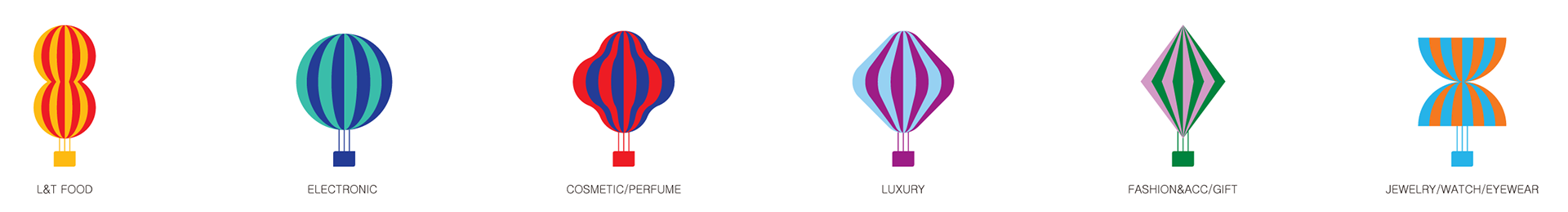
We reinterpreted the six identitys that symbolize Lotte Duty Free as 3D characters to create a futuristic brand video suitable for global stores.
대홍기획으로부터 롯데 브랜드 아이덴티티를 강화하기 위한 프로젝트를 의뢰받았습니다.
롯데면세점을 상징하는 여섯 개의 BI를 3D 캐릭터로 재해석하여, 글로벌 매장에 걸맞은 미래지향적 브랜드 영상을 제작하고자 했습니다.
We reinterpreted the six identitys that symbolize Lotte Duty Free as 3D characters to create a futuristic brand video suitable for global stores.
대홍기획으로부터 롯데 브랜드 아이덴티티를 강화하기 위한 프로젝트를 의뢰받았습니다.
롯데면세점을 상징하는 여섯 개의 BI를 3D 캐릭터로 재해석하여, 글로벌 매장에 걸맞은 미래지향적 브랜드 영상을 제작하고자 했습니다.
시각적 접근
전반적인 시각적 접근 방식은 두 가지였습니다.
첫째, 기존 BI의 성격을 해치지 않는 것.
둘째, 각 파트의 아이덴티티를 더욱 강화할 방법을 찾는 것이었습니다.
첫째, 기존 BI의 성격을 해치지 않는 것.
둘째, 각 파트의 아이덴티티를 더욱 강화할 방법을 찾는 것이었습니다.
Visual Approach
There were two main directions in our visual approach.
First, to preserve the essence of the original BI.
Second, to find ways to amplify the identity of each part.
First, to preserve the essence of the original BI.
Second, to find ways to amplify the identity of each part.
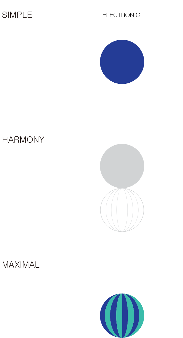
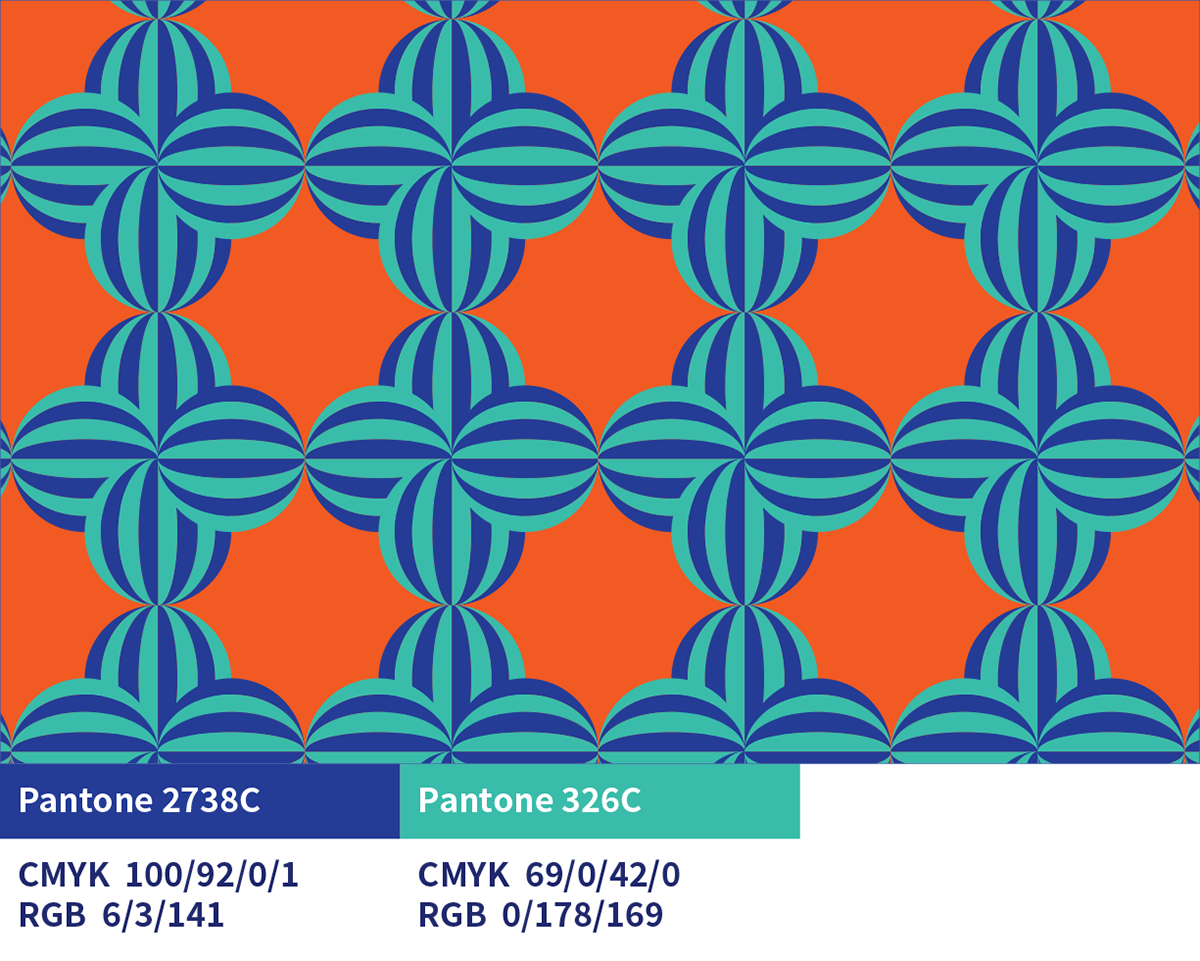
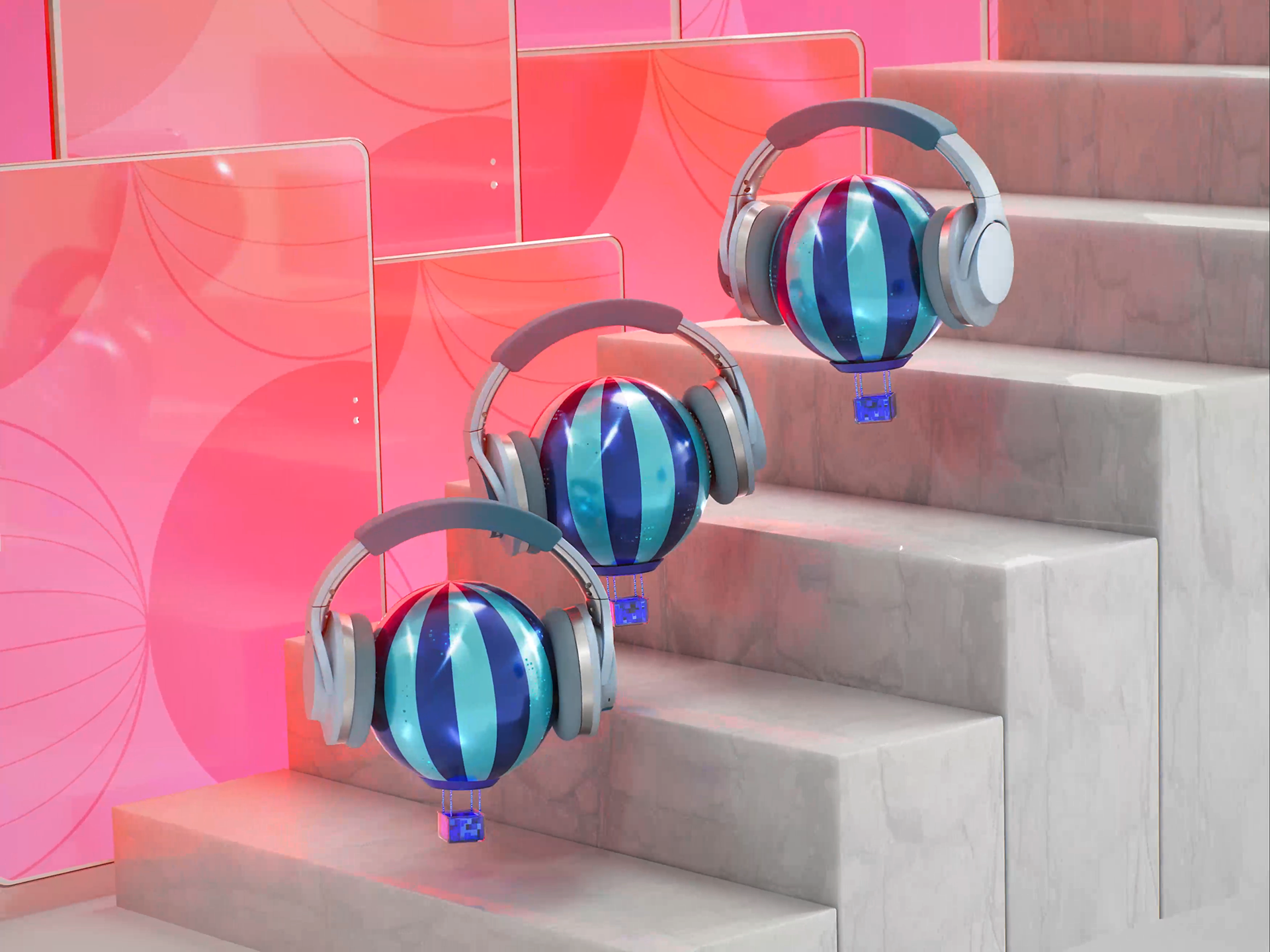
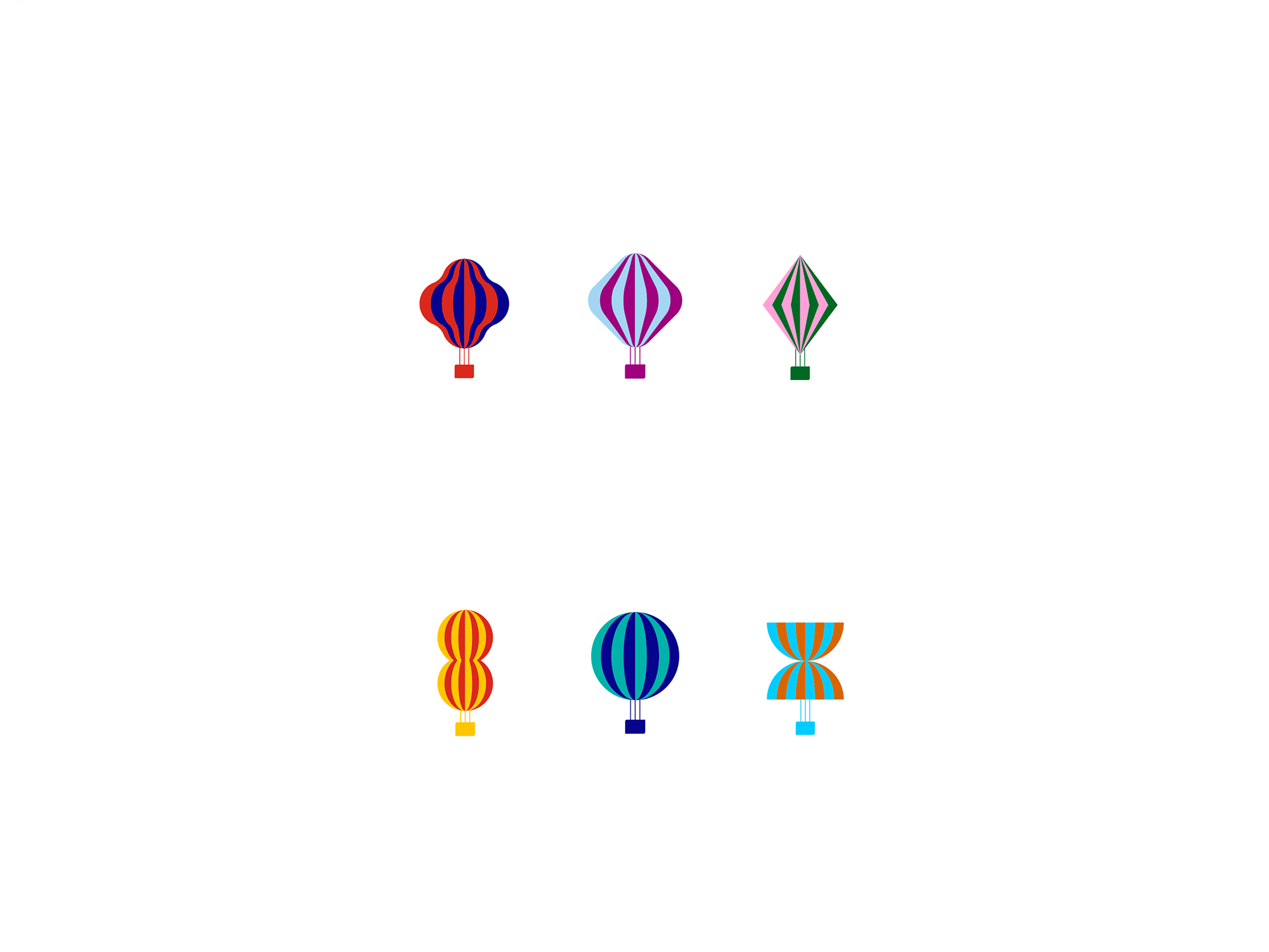
우리는 캐릭터마다 뚜렷한 개성을 불어넣었습니다.
컬러와 성격을 통해 자연스럽게 구분되도록 했습니다.
맏이 투투는 즐거운 파티의 분위기를 떠올리게 했고,
너디는 블루 톤과 하이테크 조명을 더해 ‘얼리어답터’의 성격을 강조했습니다.
컬러와 성격을 통해 자연스럽게 구분되도록 했습니다.
맏이 투투는 즐거운 파티의 분위기를 떠올리게 했고,
너디는 블루 톤과 하이테크 조명을 더해 ‘얼리어답터’의 성격을 강조했습니다.
Each character was given a distinct personality.
We used color and traits to make them stand apart.
Tutu, the eldest, evoked the joy of a festive party,
while Nerdy emphasized the spirit of an early adopter, with blue tones and high-tech lighting.
We used color and traits to make them stand apart.
Tutu, the eldest, evoked the joy of a festive party,
while Nerdy emphasized the spirit of an early adopter, with blue tones and high-tech lighting.


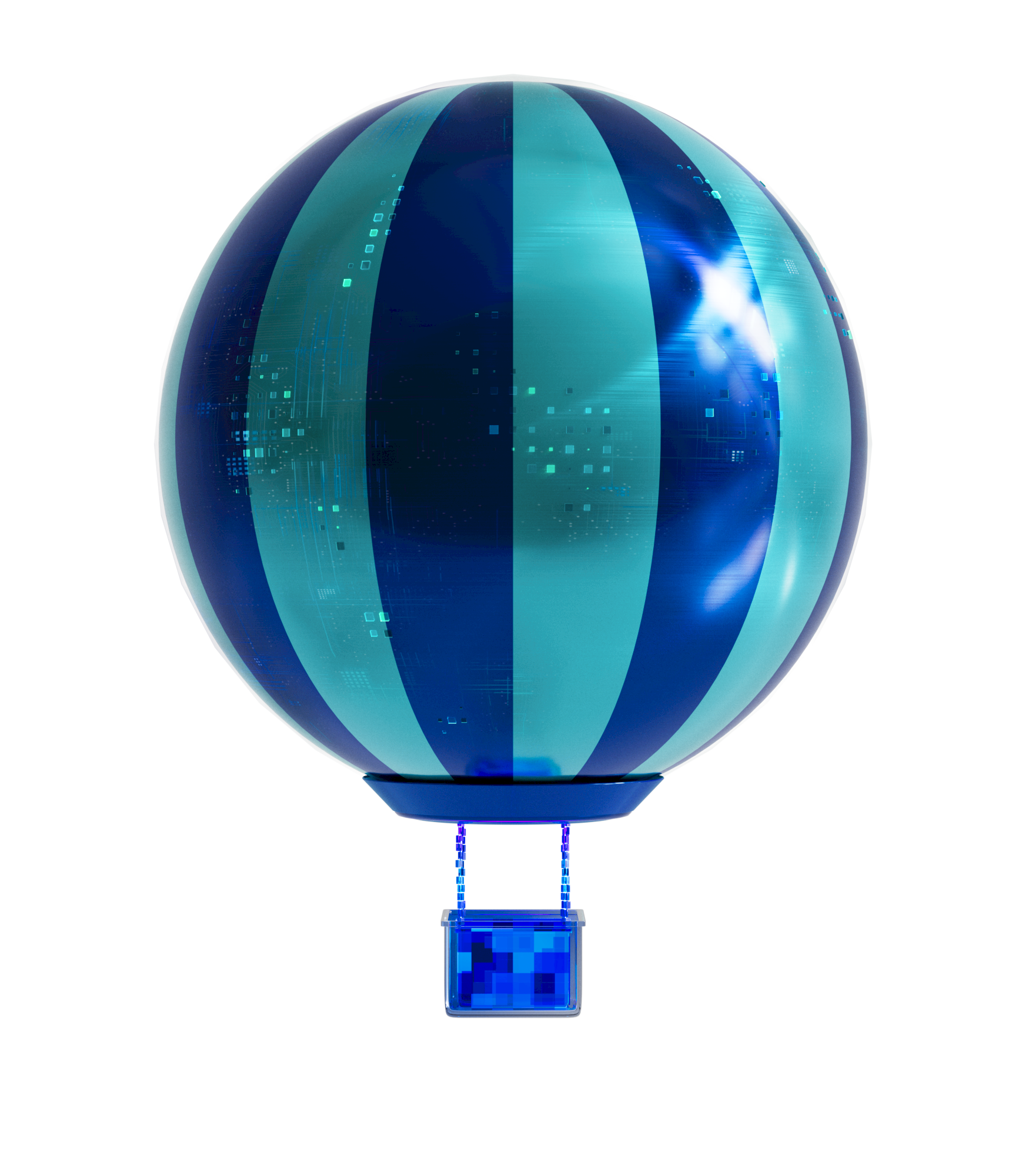
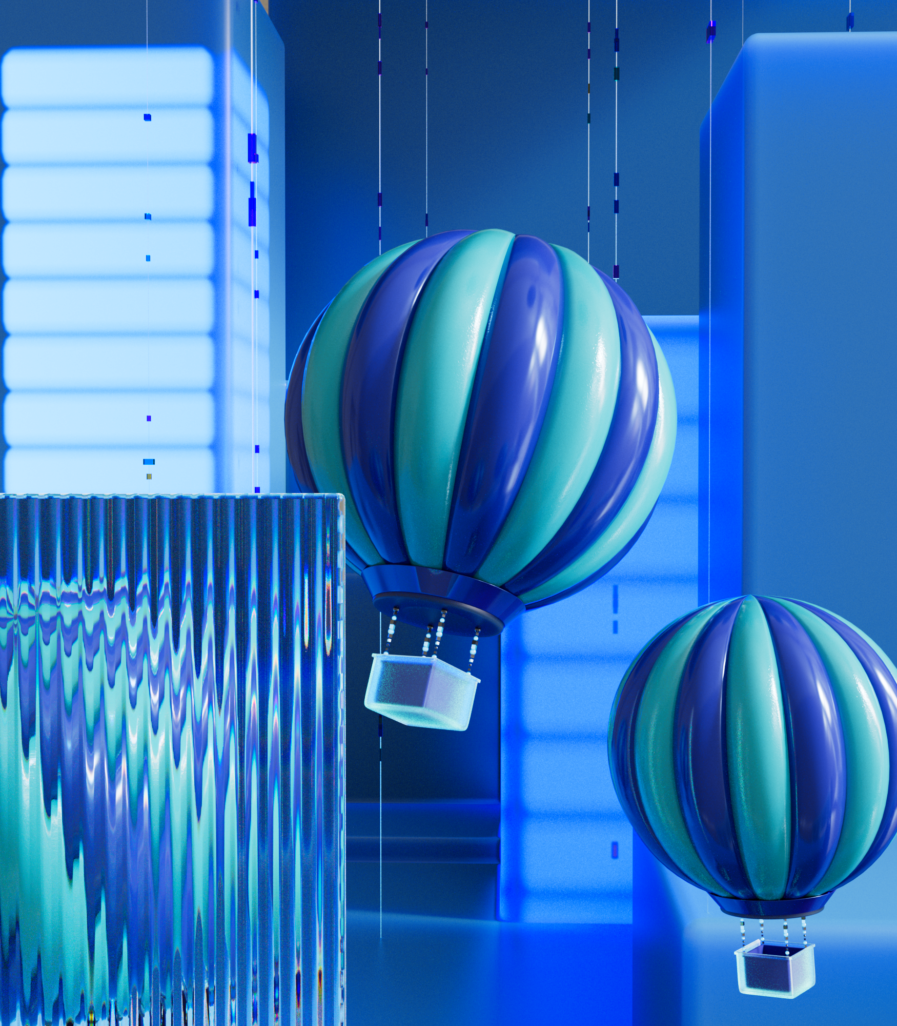
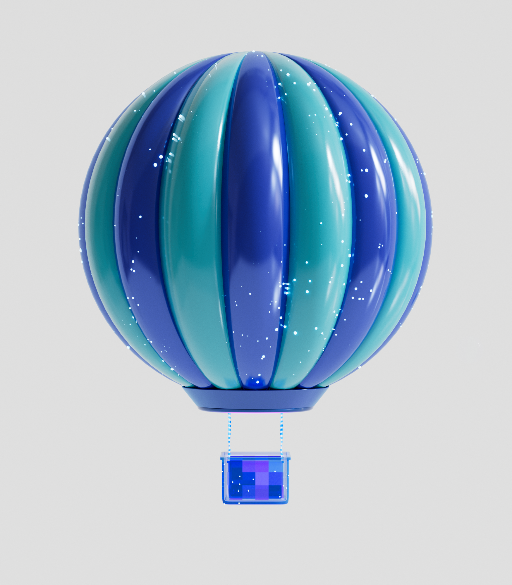
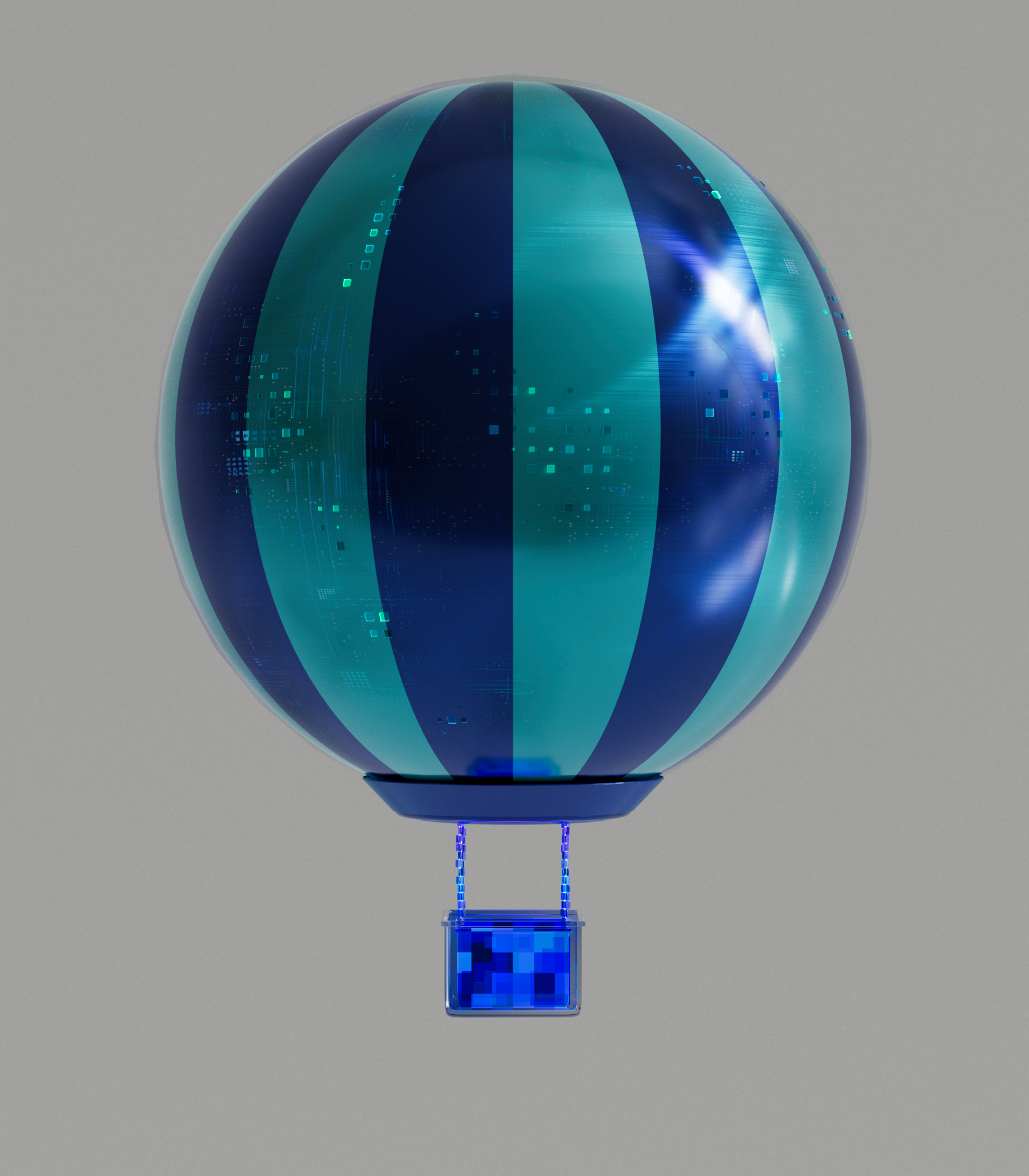
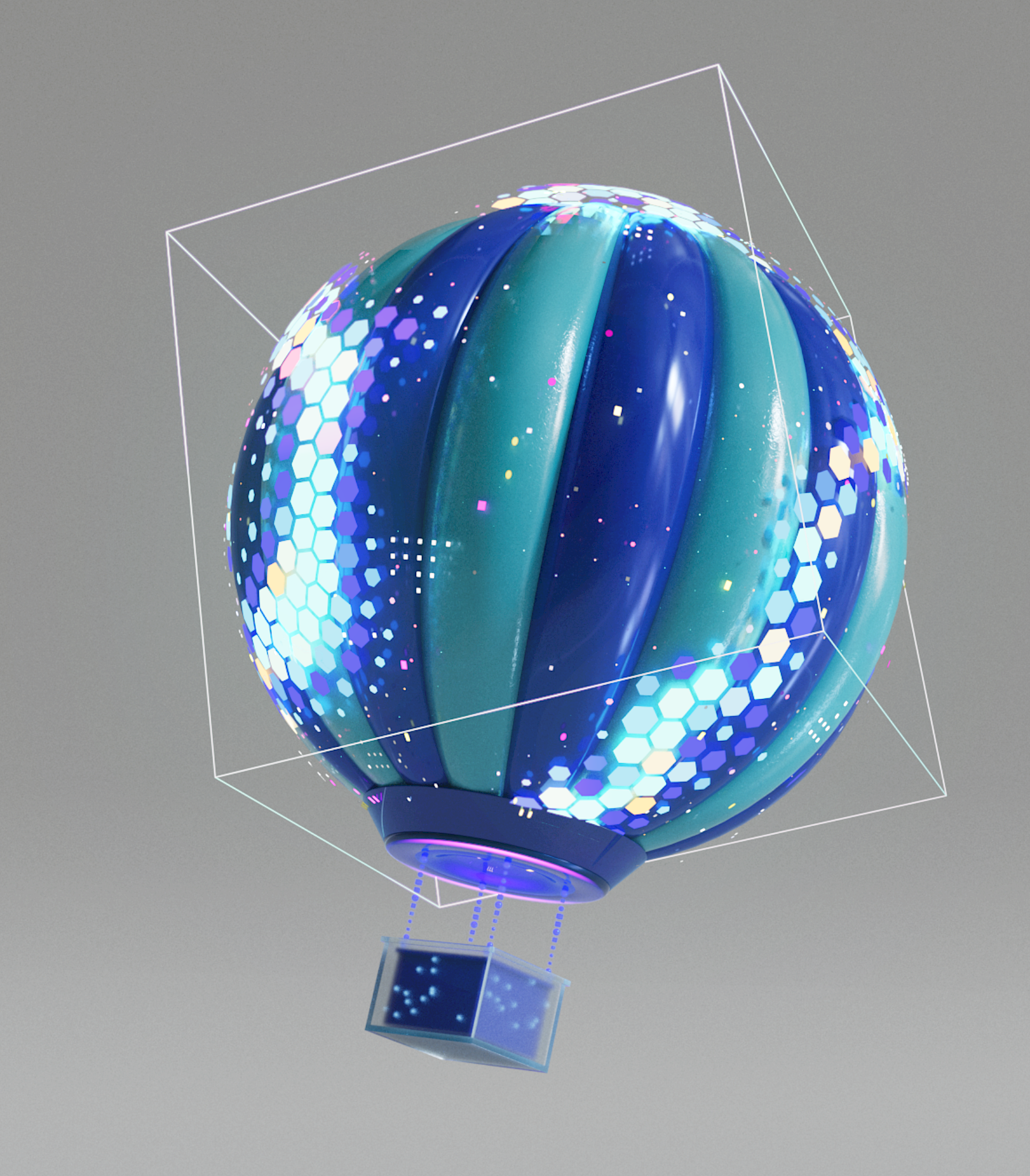
front
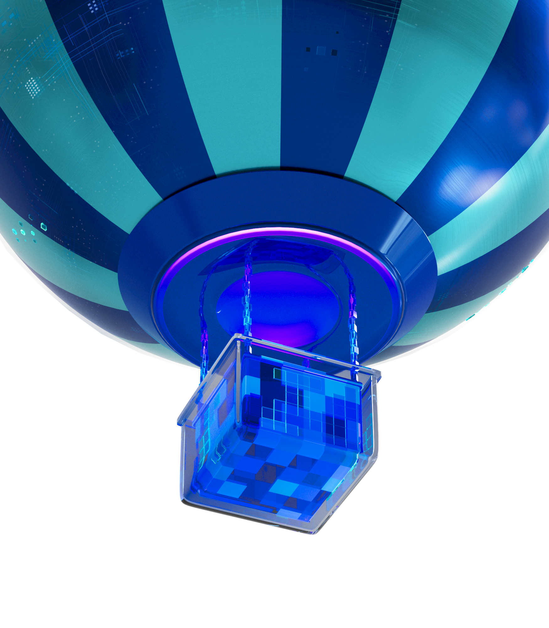
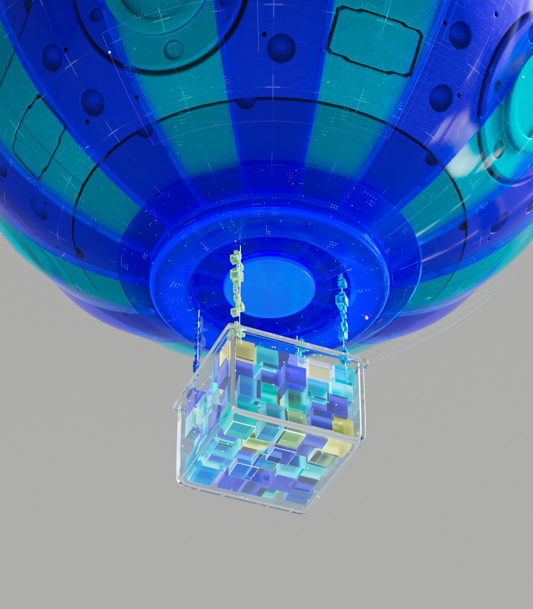
balloonbox
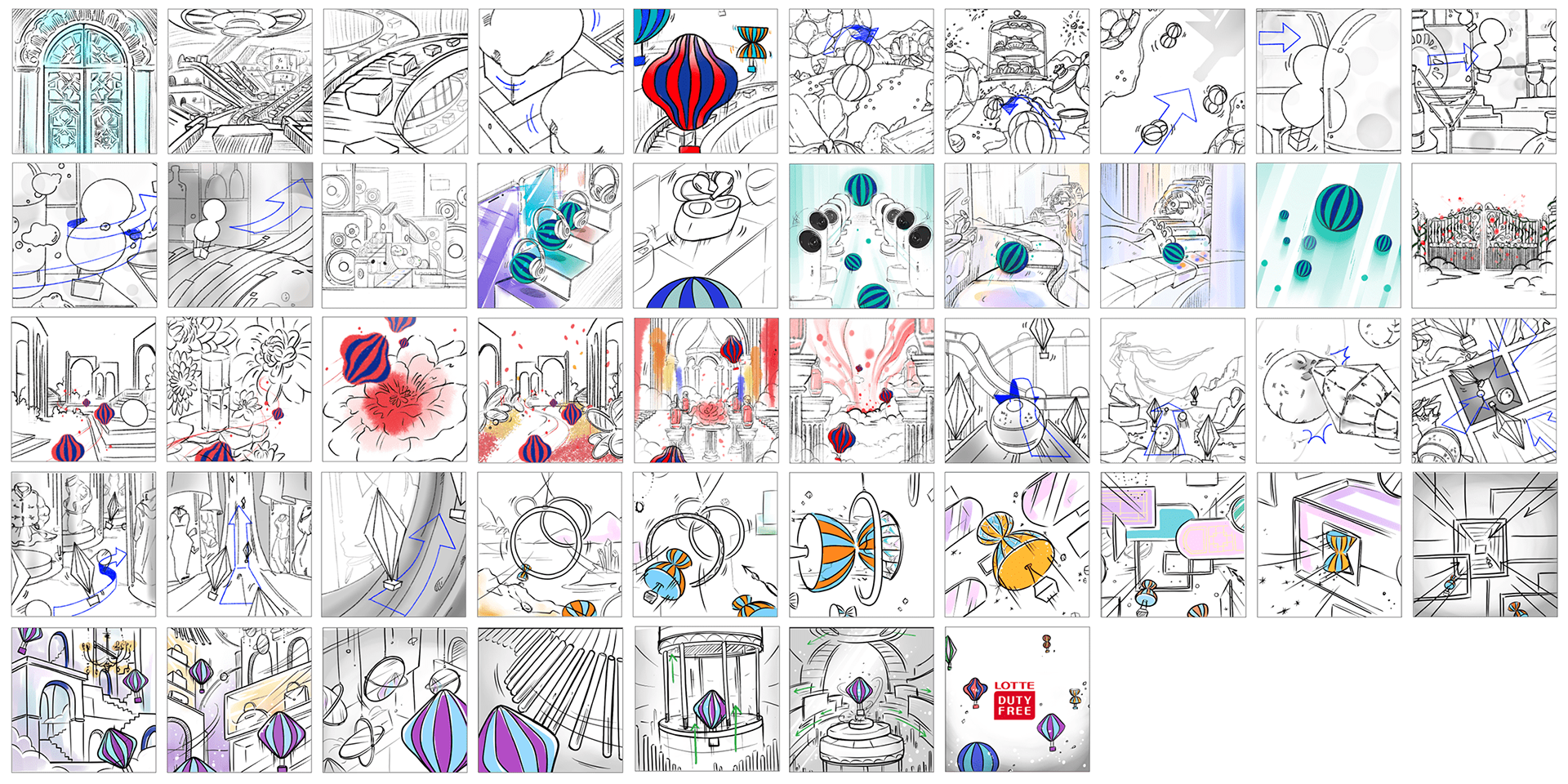
Final Video
추상적 공간과 내러티브
이 광고의 비주얼을 완성하기 위해,
각 스토리의 배경이자 무대가 될 추상적 공간을 구축했습니다.
각 스토리의 배경이자 무대가 될 추상적 공간을 구축했습니다.
여섯 개의 세트는 모두 등장인물들의 아이덴티티를 기반으로 디자인되었으며,
각 세트의 엔딩 트랜지션을 동일하게 설정해 하나의 맥락으로 이어지도록 구성했습니다.
이러한 방식은 독립적인 여섯 편의 영상을 유기적으로 묶어주는 장치가 되었습니다.
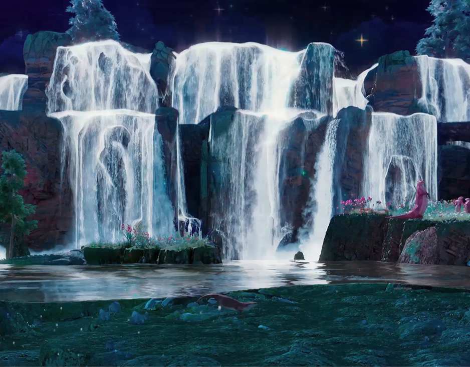
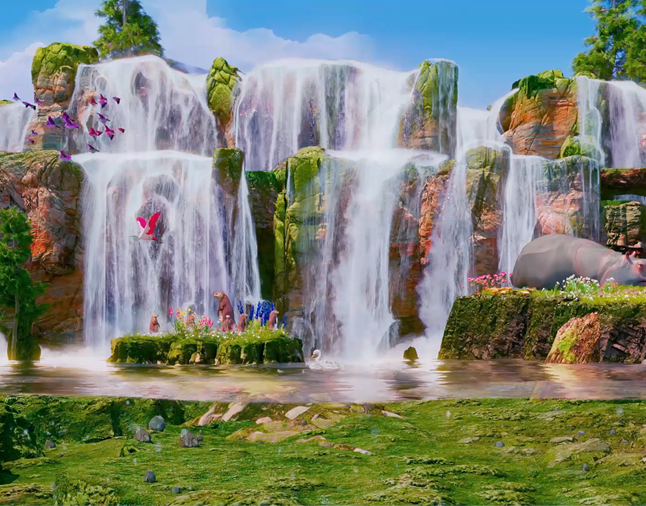
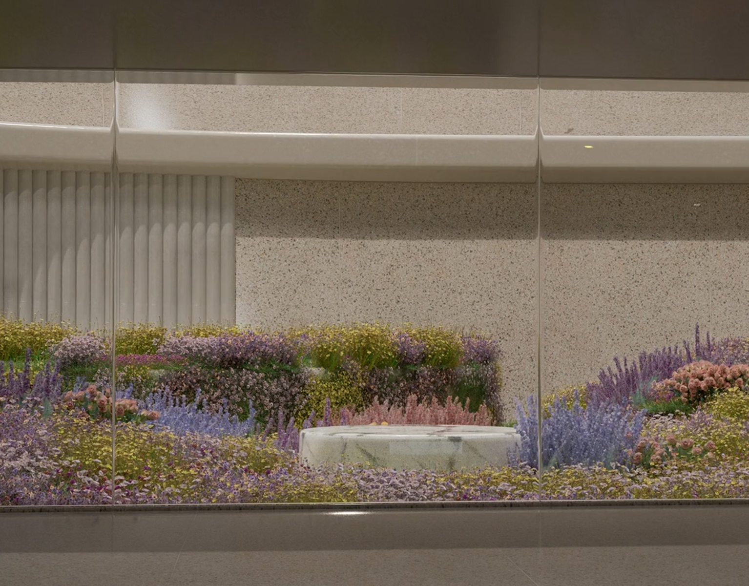
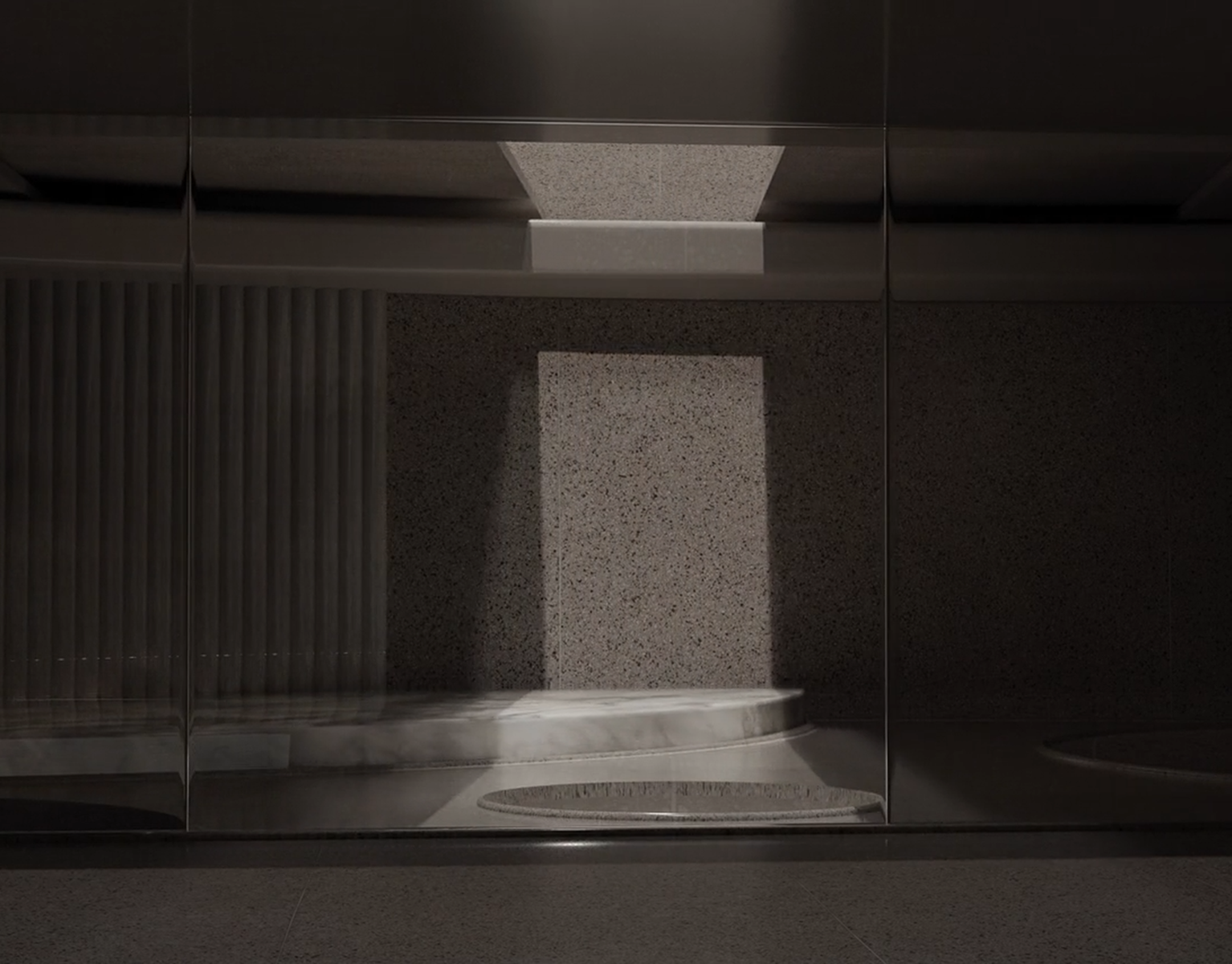
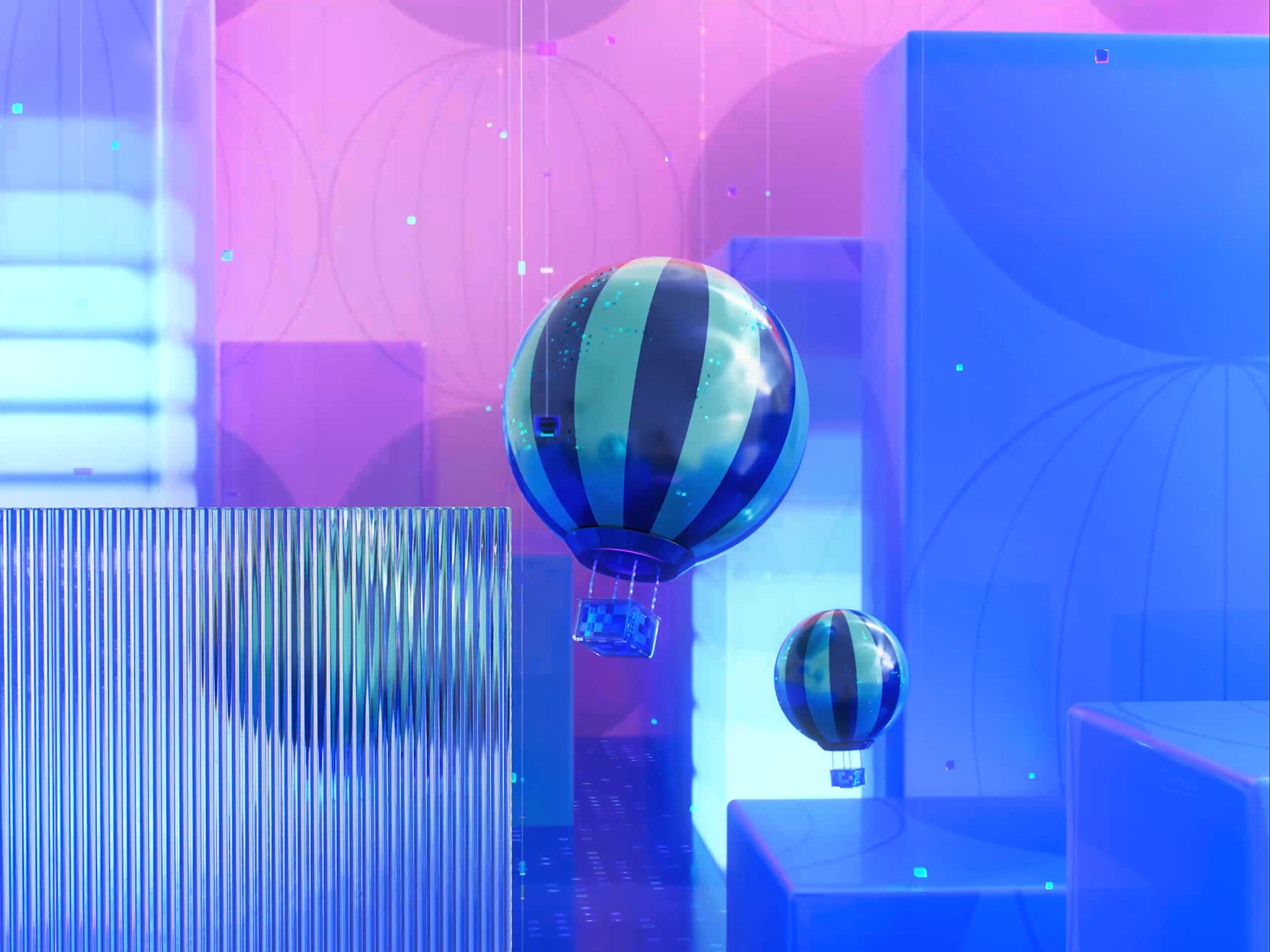
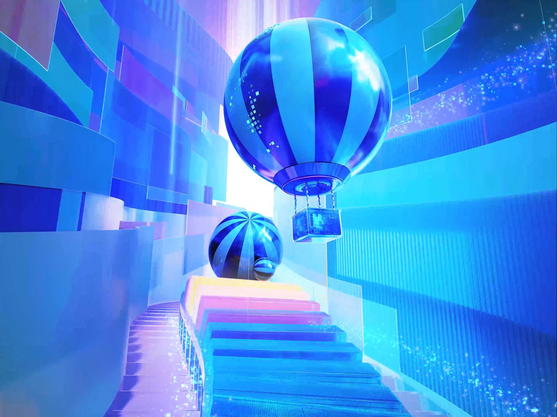
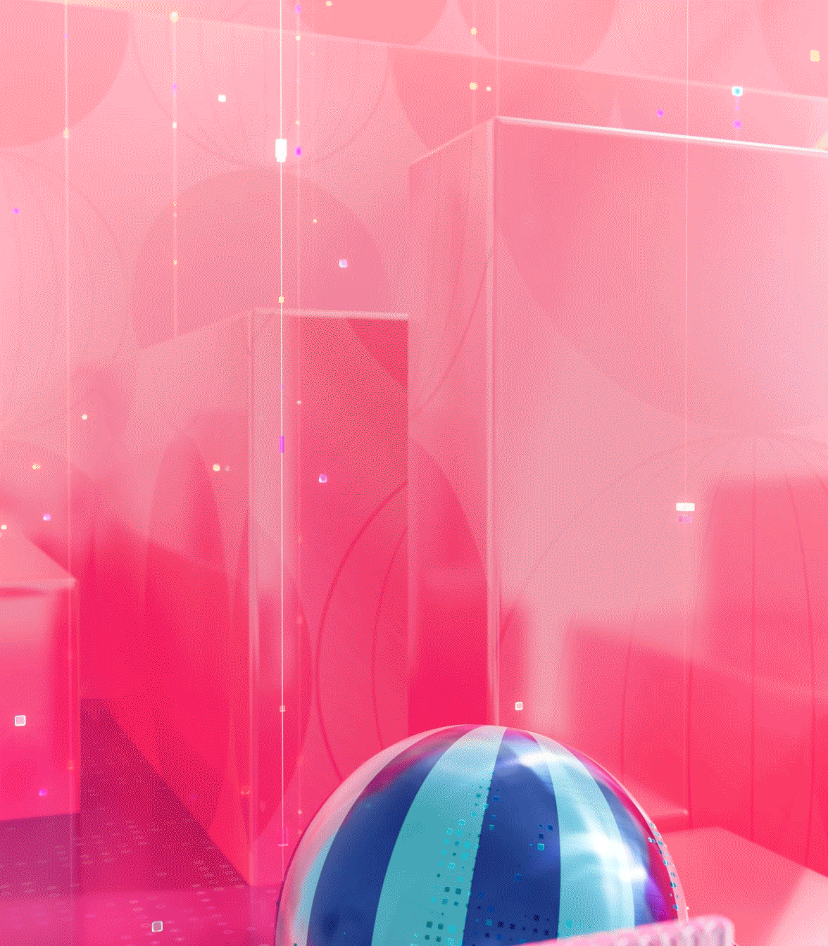
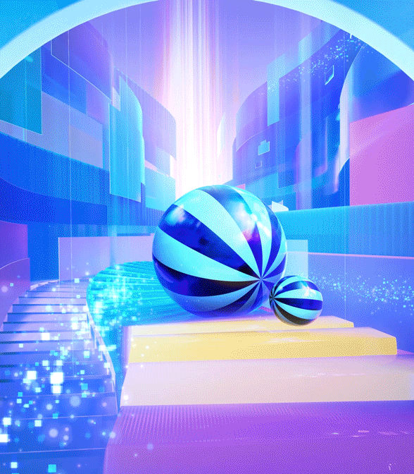
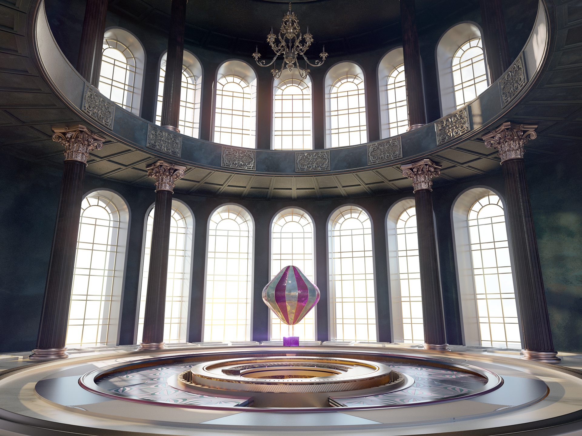
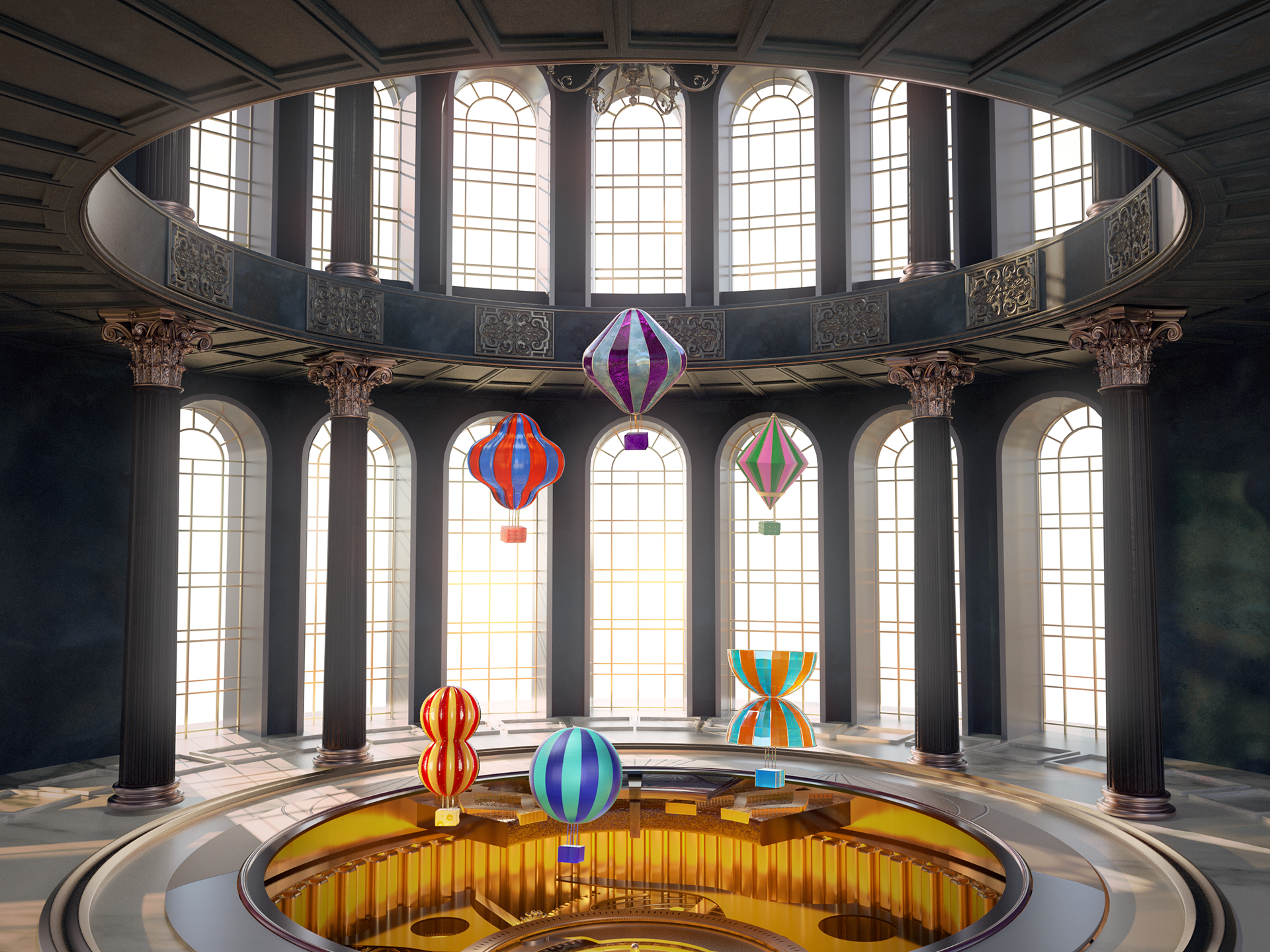
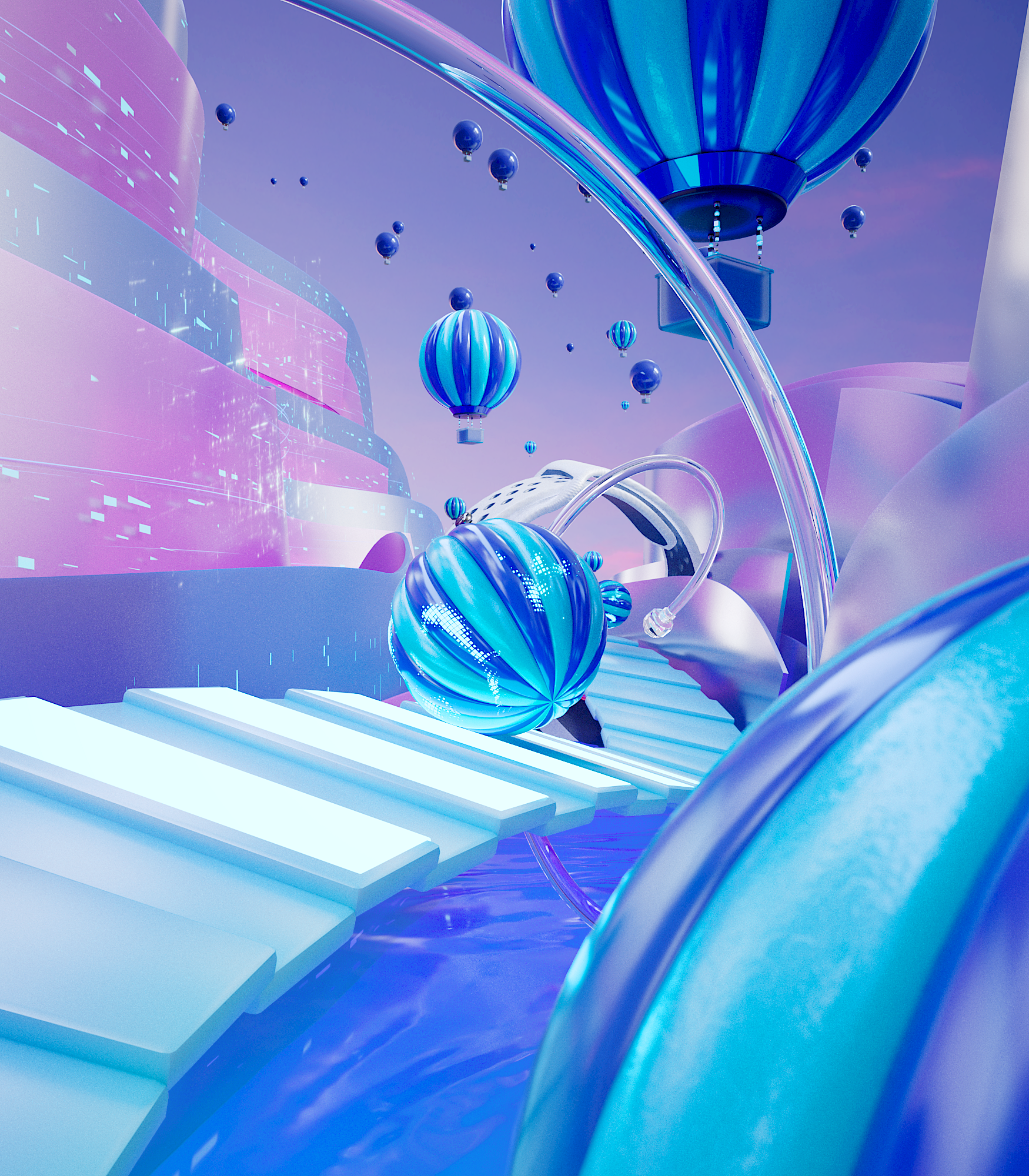
Setup 1 : Abstract Space & Narrative
To complete the visuals of these commercial, we built abstract spaces that serve as both the background and stage for each story.
Each of the six sets was designed based on the identity of the characters, with unified ending transitions applied to ensure continuity.
This approach allowed the six independent films to be tied together into one cohesive narrative.
screen size


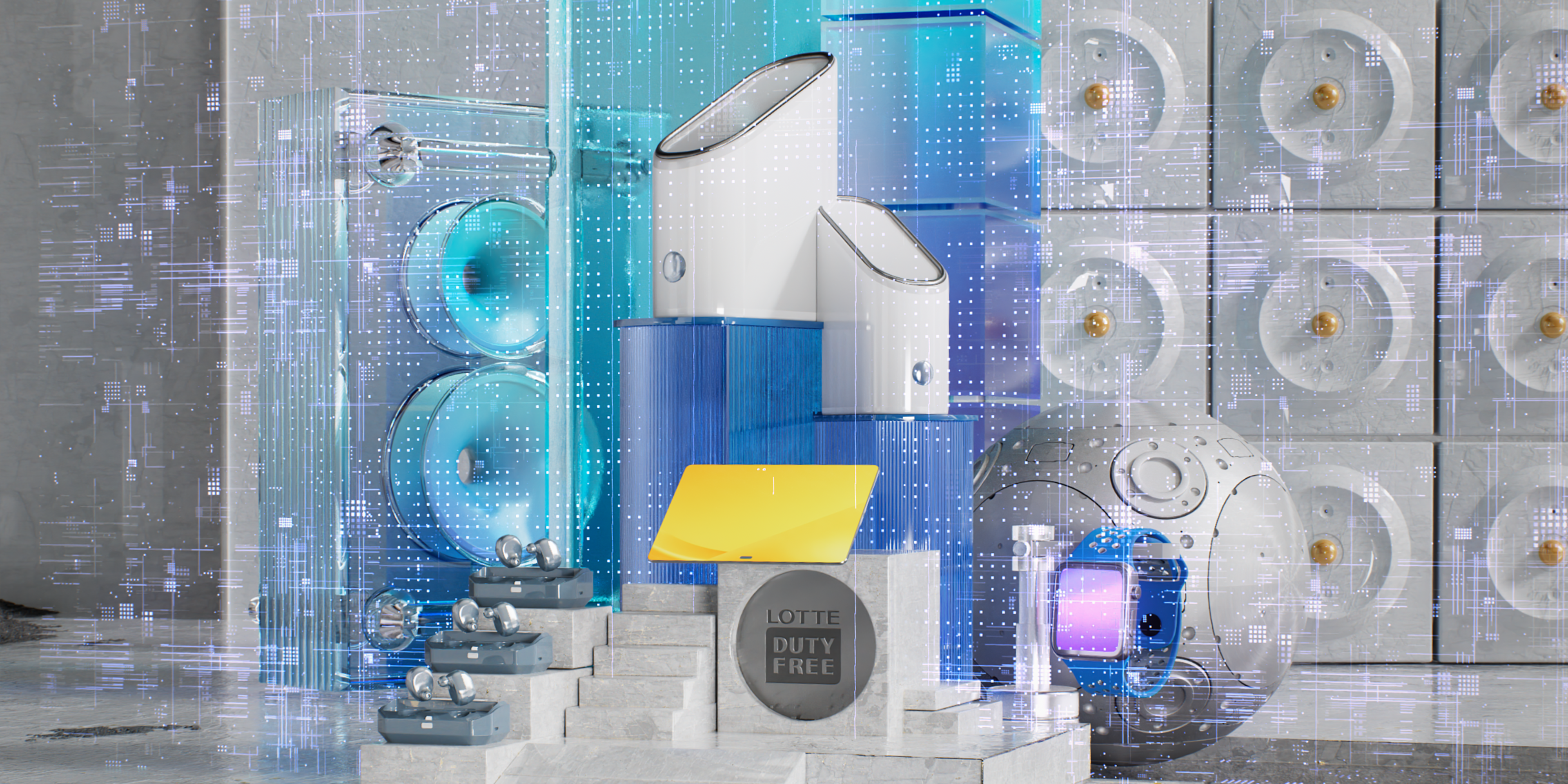
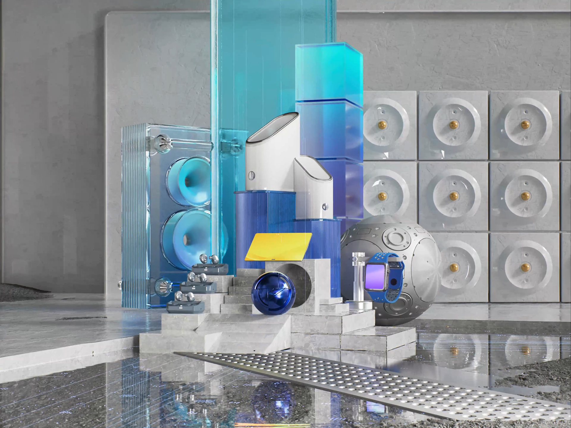
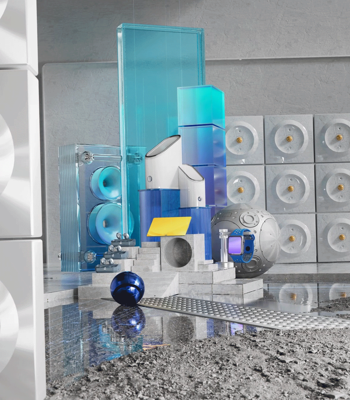
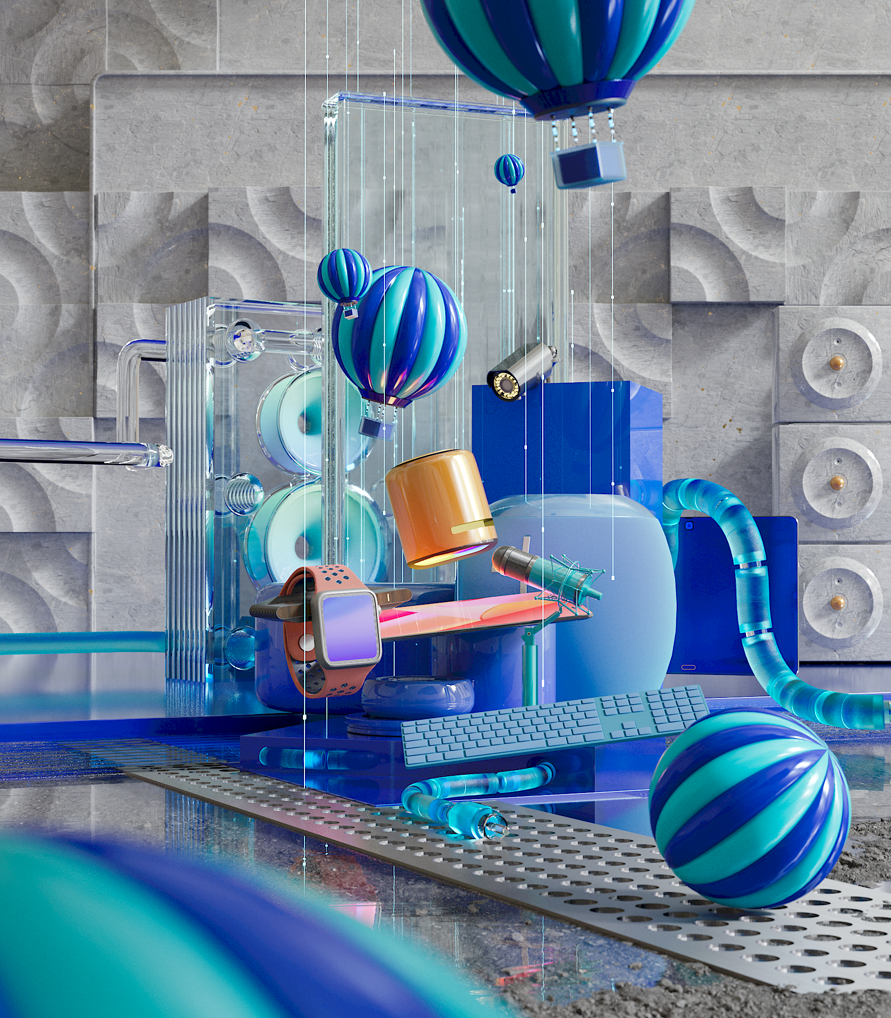
제품 기반의 세트 디자인
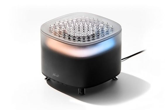
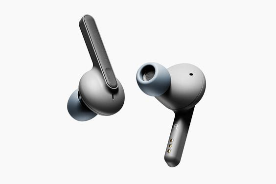
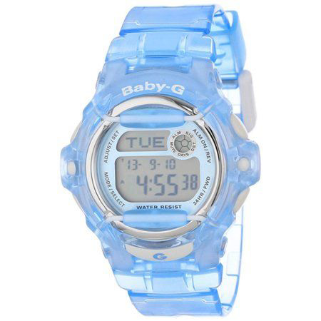
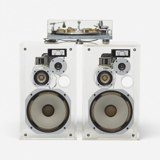
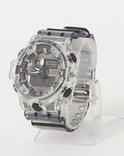
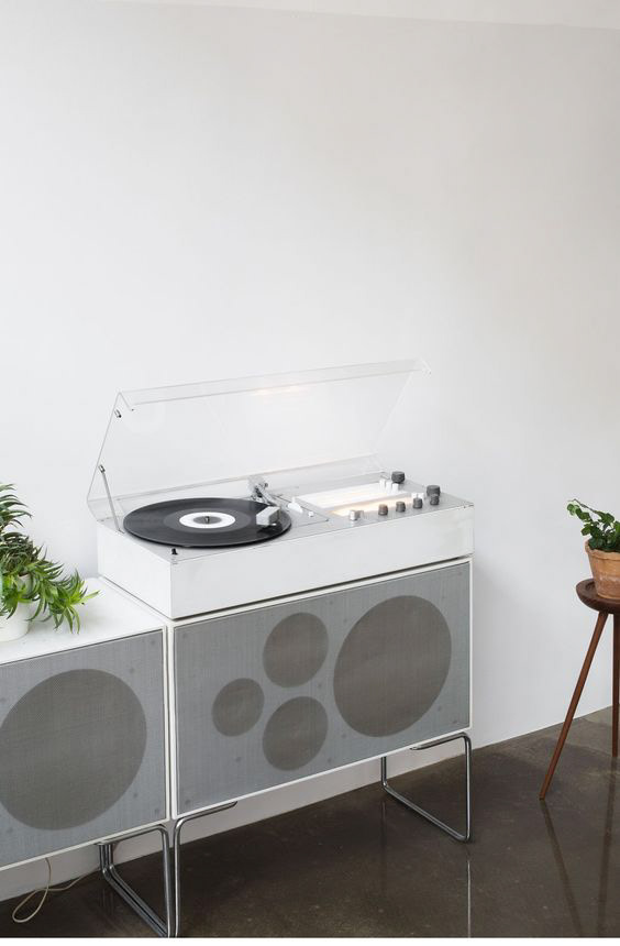
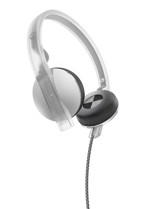
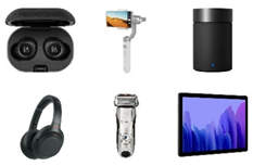
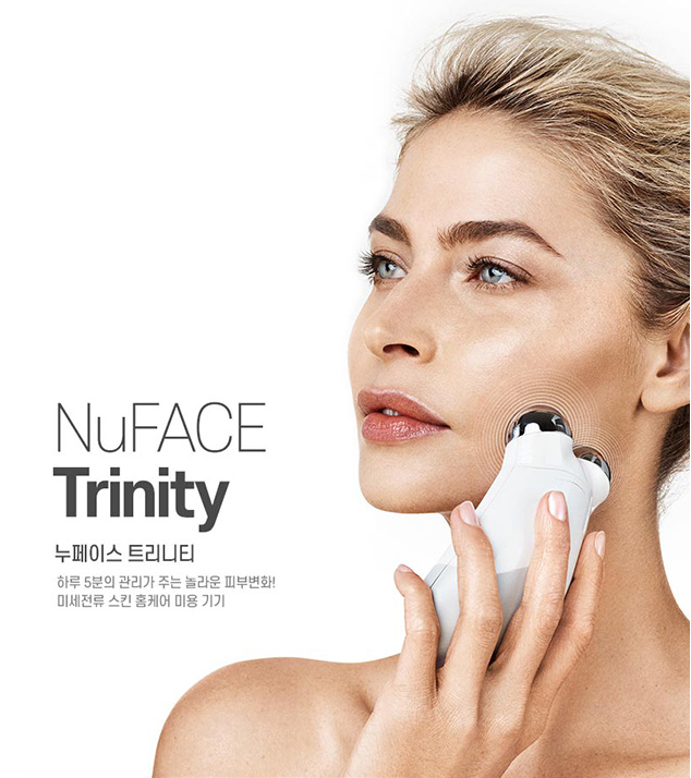
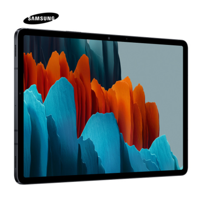
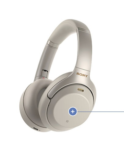
면세점에서 판매되는 LED 스피커, 투명 오브제, 헤드셋, 태블릿, 이어폰 등
다양한 제품들을 차용해 세트를 구축했습니다.
이 오브제들은 단순한 소품이 아니라,
브랜드의 성격을 담아내는 공간으로 변모했습니다.
다양한 제품들을 차용해 세트를 구축했습니다.
이 오브제들은 단순한 소품이 아니라,
브랜드의 성격을 담아내는 공간으로 변모했습니다.
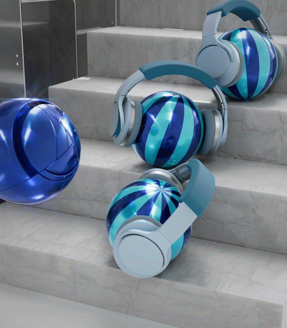
그 안에서 ‘너디’는 자유롭게 유영하며 이 장치들을 탐색합니다.
빛과 사운드, 테크놀로지적 요소가 어우러진 무대 위에서,
너디의 움직임은 곧 브랜드 아이덴티티를 강화하는 시각적 메타포가 되었습니다.
빛과 사운드, 테크놀로지적 요소가 어우러진 무대 위에서,
너디의 움직임은 곧 브랜드 아이덴티티를 강화하는 시각적 메타포가 되었습니다.
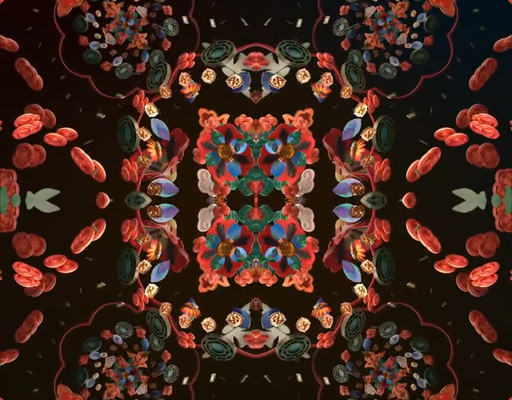
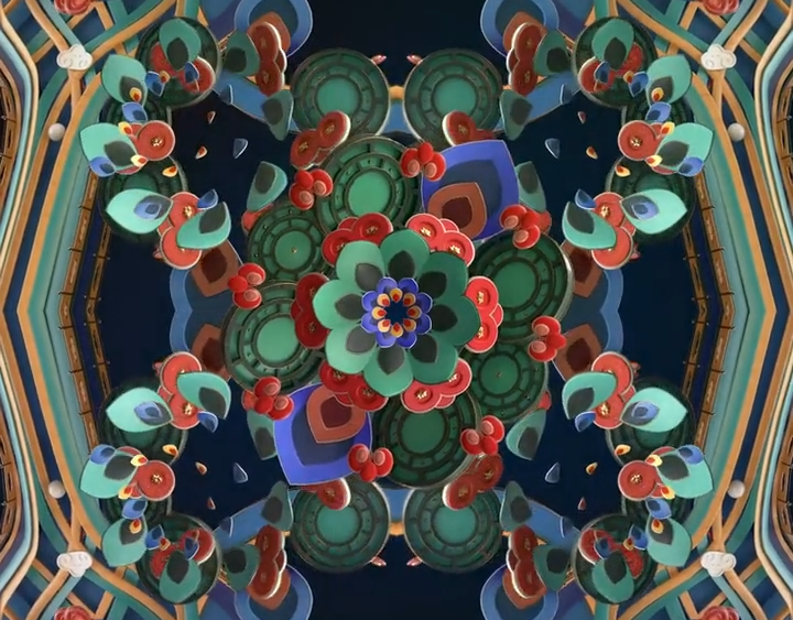
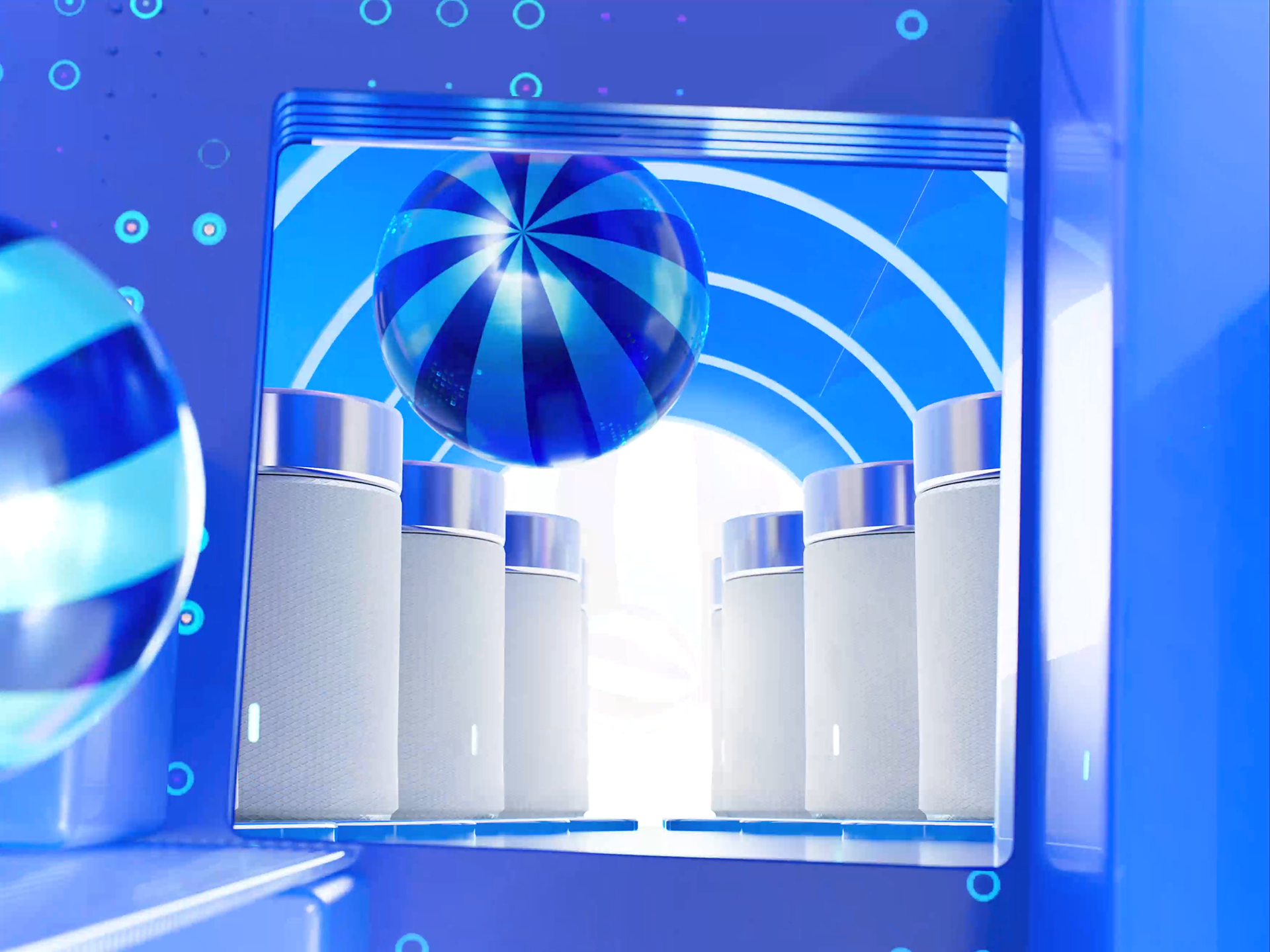
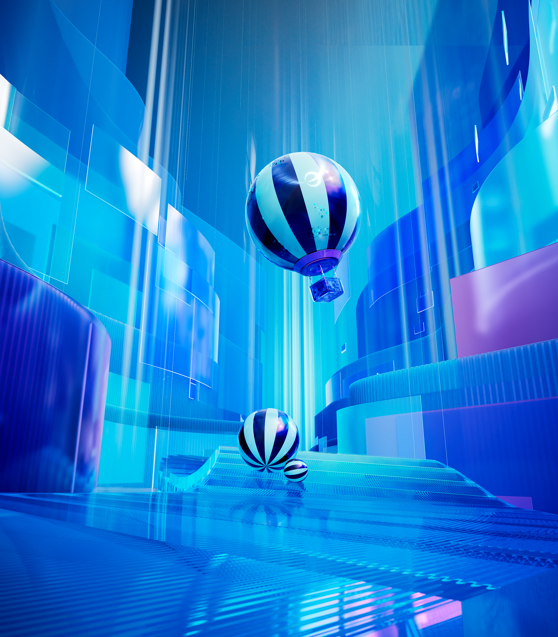
Setup 2 : Product-based Set Design
We built the set by incorporating various duty-free products such as LED speakers, transparent objects, headsets, tablets, and earphones.
These objects were transformed from mere props into a space that embodied the brand’s character.
These objects were transformed from mere props into a space that embodied the brand’s character.
Within this stage, Nerdy drifts freely, exploring each device.
On a stage where light, sound, and technological elements converge, Nerdy’s movements became a visual metaphor that reinforces the brand identity.
On a stage where light, sound, and technological elements converge, Nerdy’s movements became a visual metaphor that reinforces the brand identity.
Role: Development and modeling of “Nerdy” / Procedural design, animation, lighting, and look development / Creation of Harry’s ending sequence
2023년에는 본 캠페인을 변형한 4:3 비율의 별도 광고도 제작되었습니다.
시드니 매장에서의 긍정적인 반응을 바탕으로,
명동 본점에서도 추가 상영이 진행되며 프로젝트의 확장성을 입증했습니다.
명동 본점에서도 추가 상영이 진행되며 프로젝트의 확장성을 입증했습니다.
In 2023, a separate 4:3 version of the campaign was also produced.
Following the positive reception in Sydney,
the content was additionally showcased at the Myeongdong store, highlighting the project’s scalability.
the content was additionally showcased at the Myeongdong store, highlighting the project’s scalability.
the following are some early rnd and styleframes I created for the project

For full project details including credits see here
Credits
Bread Communications
Bread Communications
Client
Daehong
Daehong
Date
2022
Director
Park Jung-sik
Lee Jung-eun
Creator
Lee Jung-eun
Lee Seok-bin
Choi Na-ra
Lee Jin-young
Lee Do-yoon
Kang Jun-hoi
Kim Hyung-gun
Lee Jae-woo
2022
Director
Park Jung-sik
Lee Jung-eun
Creator
Lee Jung-eun
Lee Seok-bin
Choi Na-ra
Lee Jin-young
Lee Do-yoon
Kang Jun-hoi
Kim Hyung-gun
Lee Jae-woo